
Best Color Palettes for Modern Living Room Art in 2026
Best Color Palettes for Modern Living Room Art in 2026
The fastest way to make a room feel current is through color — and art is where you can be boldest without repainting a wall. Here are the palettes defining modern living rooms in 2026, and how to choose art that uses them well.
| 01. Warm Earth & Terracotta
Grounded, sun-baked tones — terracotta, ochre, clay, and warm browns — continue to dominate. They bring instant warmth to neutral and minimalist rooms and pair beautifully with natural wood and linen.

| 02. Sage & Forest Green
Green is the defining calm-luxury color of the moment. Soft sage soothes; deep forest green adds richness and depth. Both work as either the star of a piece or a grounding accent, and both sit easily alongside wood and stone.
| 03. Moody Blues & Teal
From dusty denim to deep teal, blues bring a cool, contemplative counterpoint to all the warm tones — especially effective in rooms with plenty of natural light, where they read as serene rather than cold.

| 04. Quiet Neutrals with Texture
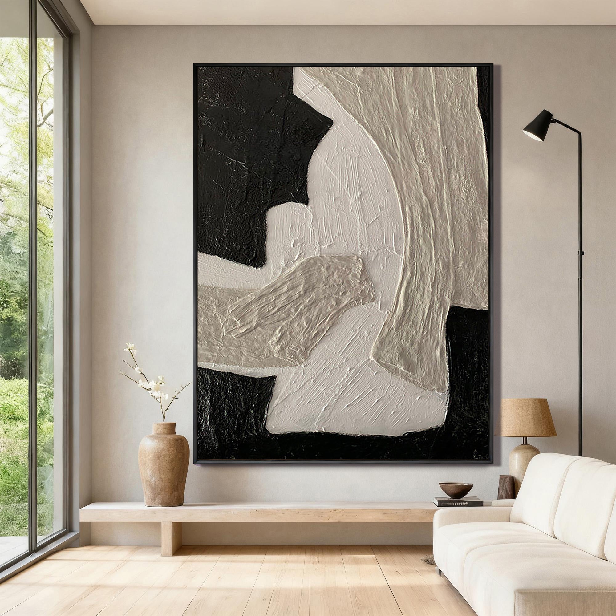
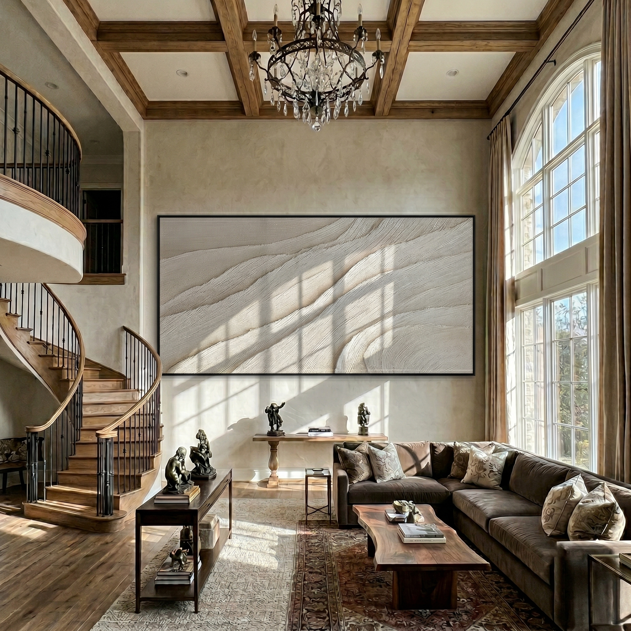
Cream, oatmeal, plaster white, and soft beige remain the backbone of the modern living room. The shift for 2026 is texture over color — sculptural, tonal pieces that create interest through relief and shadow rather than bright hues.

| 05. One Bold Accent
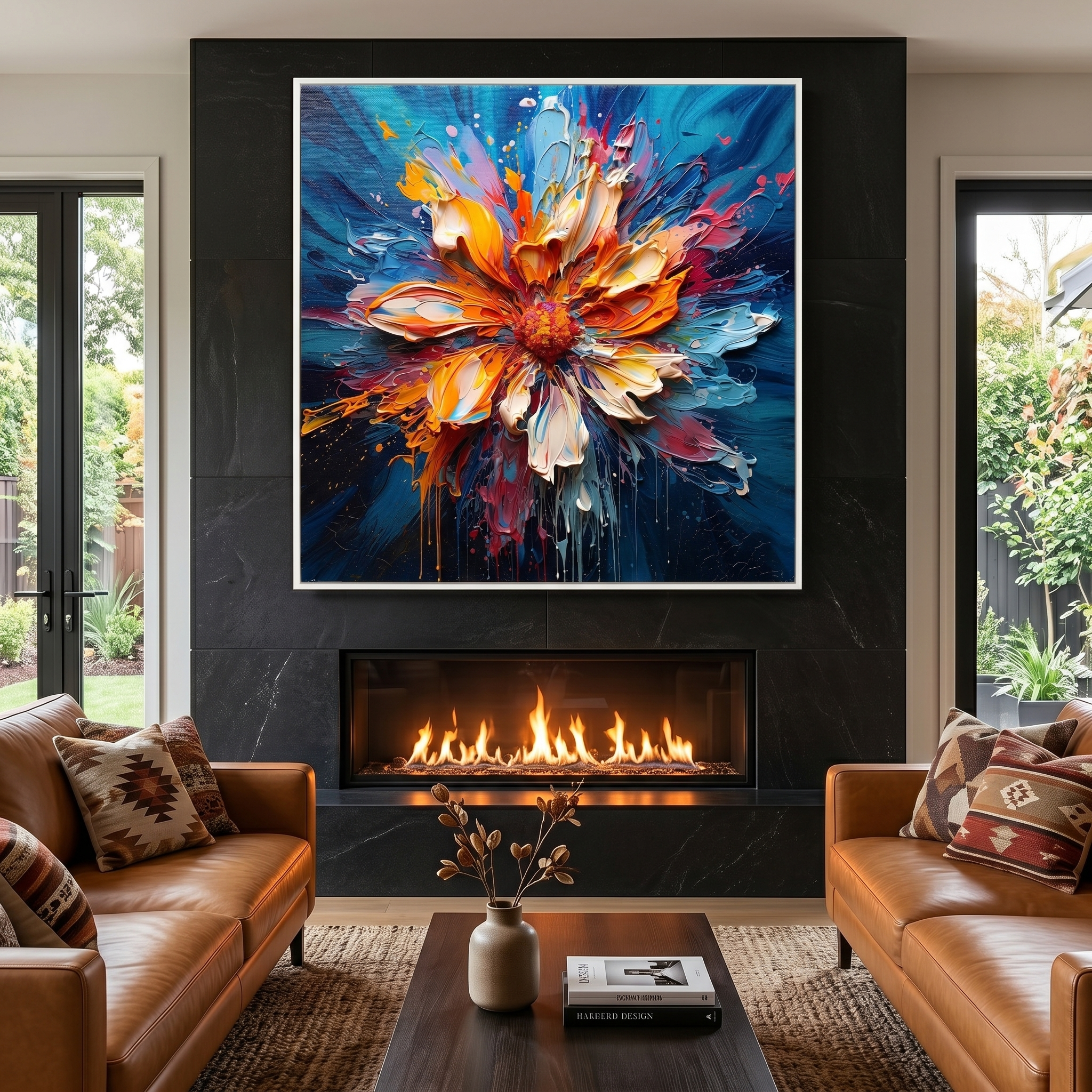
If your room is mostly neutral, a single piece with a confident pop — coral, amber, or multicolor — becomes the focal point the whole space organizes around.

| How to Choose
Decide whether you want the art to harmonize (echo a color already in the room) or contrast (introduce a new focal color). Neutral rooms can carry a bold piece; already-colorful rooms usually look best with art that harmonizes.
| Frequently Asked Questions
What art colors are trending for living rooms in 2026?
Warm earth tones and terracotta, sage and forest green, moody blues and teal, and textured neutrals are the leading palettes, with single bold accent pieces used in otherwise neutral rooms.
Should living room art match the wall color?
It doesn't need to match. Choose art that either harmonizes with colors already in the room or deliberately contrasts to become a focal point.
What color art works in a neutral room?
Neutral rooms give you the most freedom. A textured tonal piece keeps things calm, while a single bold accent color creates a striking focal point.
For help placing your palette, see styling art by interior style, or browse by color: green, beige, and colorful.


Leave a comment
This site is protected by hCaptcha and the hCaptcha Privacy Policy and Terms of Service apply.