
How to Choose the Right Oil Painting for Your Living Room
The living room is where most people spend the most time at home — and where guests form their first impression of a space. A single hand-painted oil painting can anchor the entire room, pulling together your furniture, color palette, and mood in a way that nothing else can. But choosing the right one is where most people get stuck.
This guide walks you through the five decisions that actually matter: size, placement, color, style, and whether to go with an original. Get these right and the rest takes care of itself.
1. Start With the Wall, Not the Painting
The most common mistake is choosing a painting first and then trying to make it fit. Work the other way around. Measure the wall or the furniture the art will sit above, and let those numbers guide you.
A piece of art should feel intentional, not lost. As a rule of thumb, a painting hung above a sofa or console should span roughly two-thirds to three-quarters of the furniture's width. So above a 90-inch sofa, you're looking for a single piece (or a balanced pair) somewhere around 60 to 68 inches wide.
Blank walls without furniture beneath them give you more freedom. Here, a large statement painting that fills 60–75% of the open wall space reads as confident and deliberate. Going too small on a big wall is the single fastest way to make a room feel unfinished.
Not sure what dimensions you need? Our room-by-room sizing guide breaks it down wall by wall.
2. Get the Placement and Height Right
Even a beautiful painting looks wrong when it's hung too high — a surprisingly frequent error.
- Eye level is the target. Hang the painting so its center sits about 57 to 60 inches from the floor. This is the standard galleries use, and it's calibrated to average eye level.
- Above a sofa, leave roughly 6 to 12 inches of gap between the top of the sofa back and the bottom of the frame. Closer than that feels cramped; much higher and the art floats away from the furniture it's meant to relate to.
- Lighting matters. Oil paintings — especially textured, palette-knife work — come alive under directional light that rakes across the surface and catches the ridges of paint. A picture light or an angled spot does far more than overhead lighting.
3. Choose a Color Direction
You have two reliable strategies, and both work — you just need to commit to one.
Harmonize. Pull one or two colors already present in your room (a cushion, a rug, the wood tone of your floor) and choose a painting that echoes them. This creates a calm, cohesive, designed feeling.
Contrast. Choose a painting that deliberately breaks from the palette to become the room's focal point. A warm, expressive piece against a cool, neutral room draws the eye instantly and gives the space energy.
If your room is mostly neutral — whites, greys, beiges, natural wood — you have the widest freedom and can treat the painting as the room's primary source of color. If your room is already colorful, lean toward harmonizing so the space doesn't compete with itself.
4. Pick a Style and Subject That Fits the Mood
Style is personal, but it should also match what you want the room to feel like:
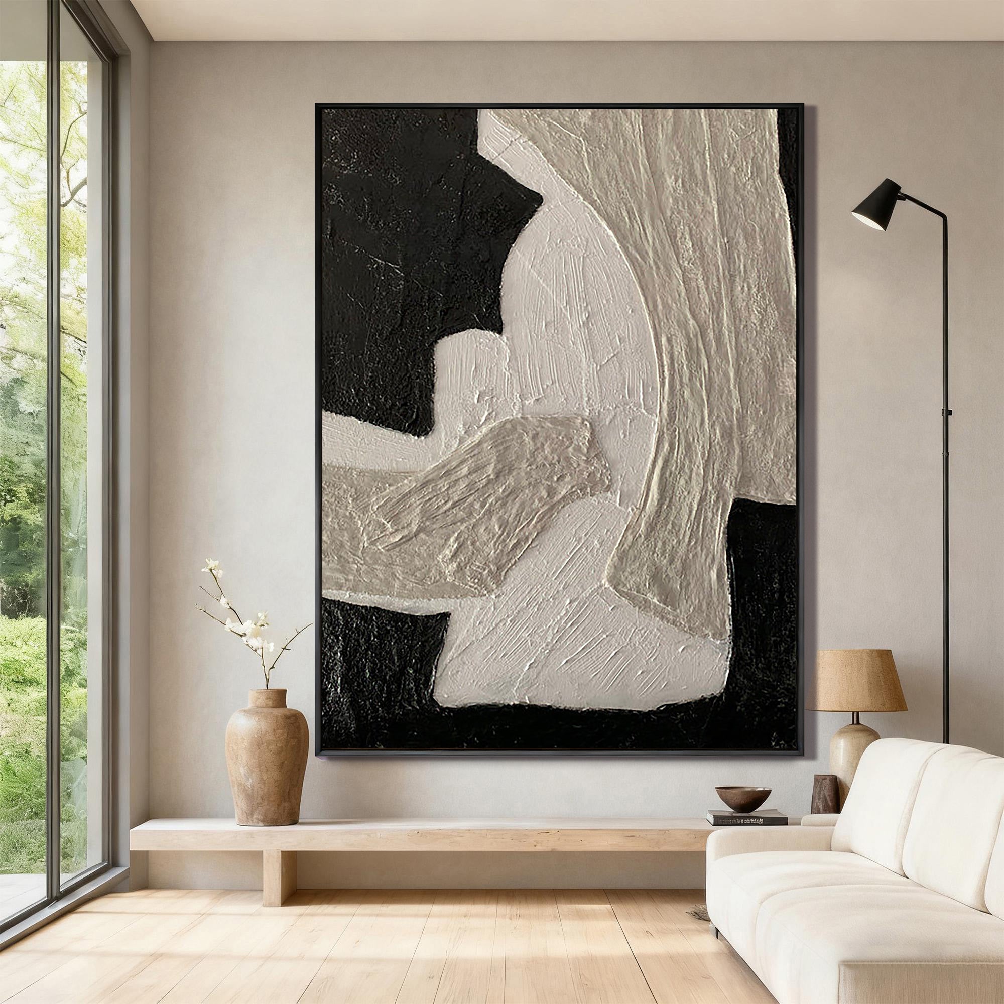
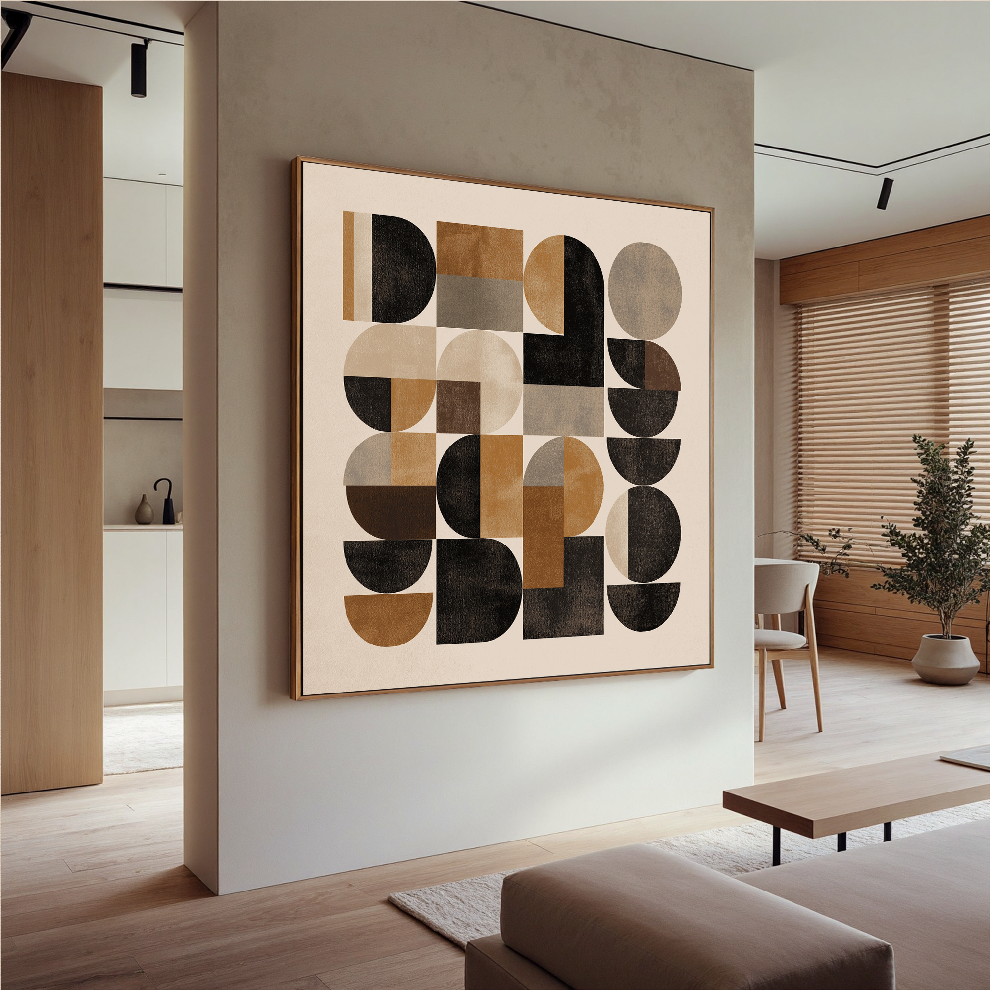
- Abstract pieces add energy and a contemporary edge without dictating a literal subject. They suit modern, minimalist, and mid-century spaces and are the most flexible choice if your taste evolves.
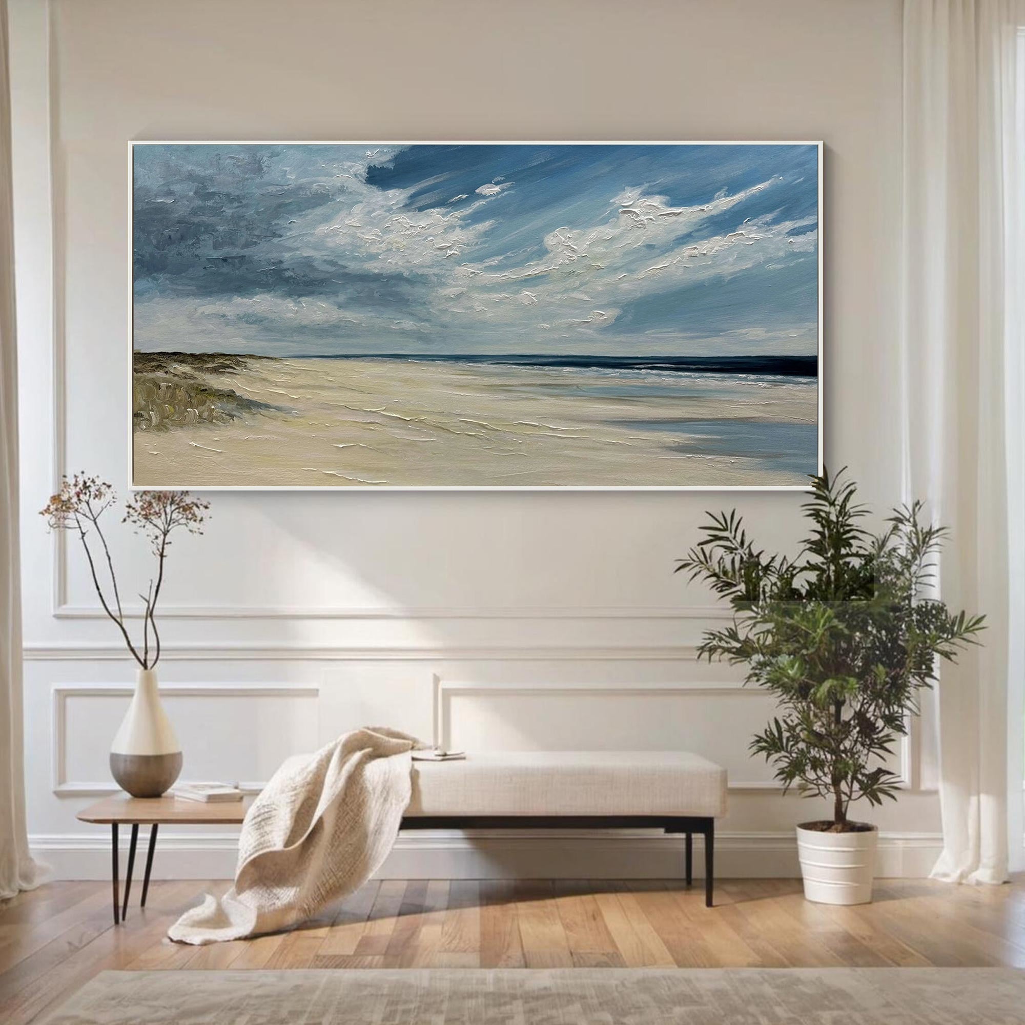
- Landscapes and seascapes bring calm, depth, and a sense of openness — a good fit for rooms where you want to relax and slow down.
- Floral and botanical work adds softness and warmth, and pairs naturally with organic, bohemian, and traditional interiors.
There's no wrong answer here, but there is a useful test: imagine the painting on your wall a year from now. The pieces people keep loving are usually the ones with a mood that matches how they actually live in the room, not just a color that matched the cushions.
Still deciding? Our guide to abstract vs. landscape oil paintings compares the two in detail.
5. Why Texture and Hand-Painting Make a Difference
This is where an original hand-painted oil painting separates itself from a mass-produced print.
A genuine oil painting has physical depth. Palette-knife work in particular builds up ridges and layers of paint that catch light differently as you move through the room and as the daylight changes through the day. A print is flat — it looks the same from every angle, in every light. Up close, the difference is immediate and impossible to fake.
Beyond the look, an original carries the mark of the hand that made it: brush and knife strokes that are unique to that single canvas. No two are identical. For a piece you'll live with for years, that individuality is most of the value.
Every Zeydrt painting is hand-painted in oil on canvas — not a giclée, not a transfer. Browse the full collection to see the texture for yourself.
Originals vs. Prints: A Quick Honest Comparison
| Original Hand-Painted Oil | Print / Giclée | |
|---|---|---|
| Texture & depth | Real, three-dimensional | Flat, printed |
| Uniqueness | One of a kind | Mass-produced |
| Ages | Develops character | Can fade |
| Value over time | Holds or grows | Minimal |
| Price | Higher upfront | Lower |
A print makes sense for a temporary space or a tight budget. For the main wall of a room you care about, an original is almost always the piece people are happiest with a year later.
Frequently Asked Questions
What size oil painting is right for a living room?
For a piece hung above furniture, aim for two-thirds to three-quarters of the furniture's width. For an open wall, fill 60–75% of the available space. Larger single statement pieces almost always look more intentional than small art on big walls.
How high should I hang an oil painting?
Hang it so the center of the painting sits 57–60 inches from the floor, which matches average eye level. Above a sofa, leave 6–12 inches between the top of the sofa and the bottom of the frame.
Should the painting match my room's colors?
It can either harmonize (echo colors already in the room for a cohesive feel) or contrast (break from the palette to create a focal point). Both work — neutral rooms give you the most freedom to let the painting bring the color.
Are hand-painted oil paintings worth it compared to prints?
For a main feature wall, yes. Hand-painted oils have real surface texture and depth that prints can't reproduce, each piece is unique, and they hold their value far better over time.
What kind of painting suits a modern living room?
Abstract and palette-knife pieces tend to suit modern and minimalist interiors best — they add energy and texture without locking you into a literal subject, and they adapt well as your taste changes.
Ready to find yours?
Take one measurement — the width of the wall or sofa where the painting will go — and start there. Browse Zeydrt's hand-painted oil paintings and filter by size to see what fits your space.
Every piece is painted by hand in oil on canvas, made to be the one thing in the room people keep looking at.


Leave a comment
This site is protected by hCaptcha and the hCaptcha Privacy Policy and Terms of Service apply.